
Some time ago, I was looking for some ways to display stock data, and then I came across with the chart below from Google finance. What I like about this chart is the possibility of filter the range of data that you want to analyze(1) keeping and overview of the entire history (2). So I decided to focus in these two features and try to elaborate something similar in QlikView.

Range Zoom In
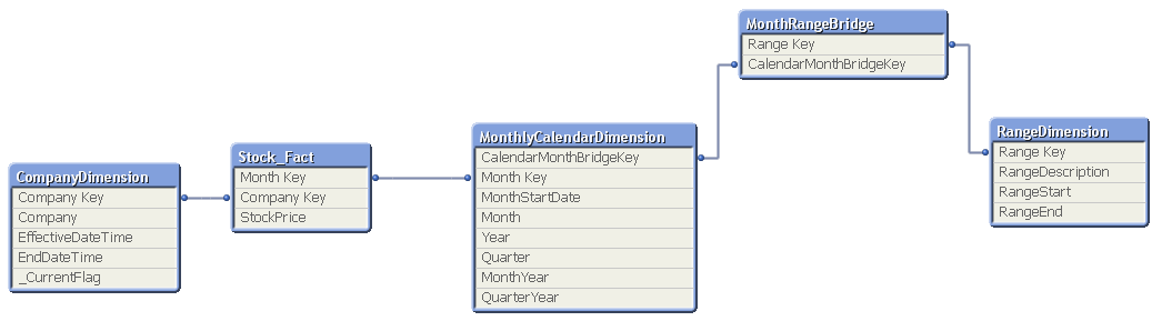
Part of my "requirement" was to be able to show the data based on a period of time selected. To do so, I created a dimension that I called "RangeDimension" to add the following values: All, 15 years, 10 years, 5 years, 2 years, 6 months, 3 months, and Year to date (YTD). Then, I associate this dimension to my monthly calendar through a bridge dimension. I preferred to update the bridge table instead of the monthly calendar to avoid having to recalculate this dimension every time.
Building the Chart in Qlik
I added two trend charts and a listbox to simulate the Google Finance chart. The list box were configured to have "Always One Selected Value" in the general properties to avoid users from selecting more than one range at the same time.

Next, the listbox was configured to display the values horizontally, and the caption was removed.


A line chart was used to display the stock data. The dimensions selected were MonthYear, and Company and the following expression were added to display the stock data across time:

In addition, the grid was enabled for both the expression and dimension axis, and added a minimum and maximum expression in the scale section:

Expressions used in the scale section:


Here is a sample of how this chart looked like:

Finally, to display the entire history, another line chart was added. For this one, only MonthYear was selected as dimension and the following expressions were used:

The set analysis ignored all the filters, this way the chart displayed always the entire history. Now, if you go back to first image (the Google finance chart), look at the area under the red number two. This is another feature that I like about this chart, you have the visibility of the entire data across time, and based on the range that you have selected, that specific area is highlighted. So, in this case to highlight the selected period of time, an expression was added in the background property:


Next, the same format than the previous chart was applied to keep them both aligned:

But, for the Minimum and Maximum scales the following expressions were used:


Observe that the RangeDescription value was ignored through the set analysis to avoid that the size of the chart changes.

Finally, both charts and list box were grouped in a container generating the following result:

When the 15y range was selected, the main chart displayed only the information from that period of time, but the secondary chart kept displaying all the data highlighting only the last fifteen years of information.
If you want, you can download a sample of this dashboard from here.
No comments:
Post a Comment